Overview
We supported a specialist video translation company from brand concept to launch: logo design, website creation, and later mobile optimisation. Working with a copywriter (Japanese-language only), we strengthened both visuals and messaging to build credibility.
Live site: media-q.com
Logo concept
We designed a symbol built from three stylised “Q”s forming a cube. It represents the relationship between your company, your clients, and the media—connected through translation as communication. The mark is simple, memorable, and scalable across print and web.
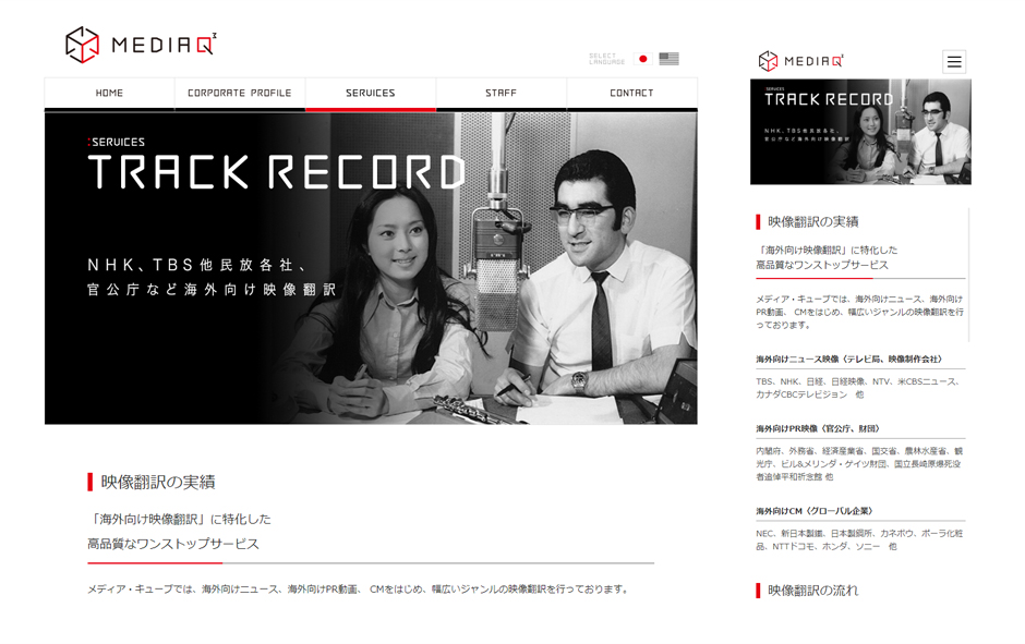
Website design & build (PC first)
The site uses a restrained palette of black, red, and white to project professionalism, with an uncluttered layout for easy navigation. Historical photography was placed to convey heritage and trust while keeping the structure standard and intuitive.
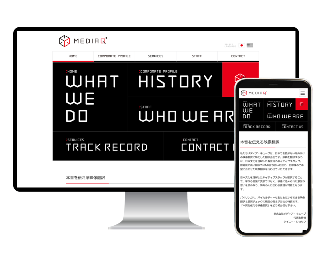
Responsive retrofit (later phase)
Originally desktop-only, the site was later adapted for smartphones. We kept the existing design and code and added responsive HTML/CSS, achieving a modern mobile experience while keeping costs under control.
Copywriting collaboration
We refreshed key headlines and adjusted content after interviews to emphasise the theme: “translation that conveys what’s truly meant.”
Copywriting support: Japanese-language only.
Cohesive brand rollout
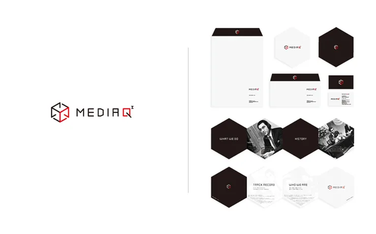
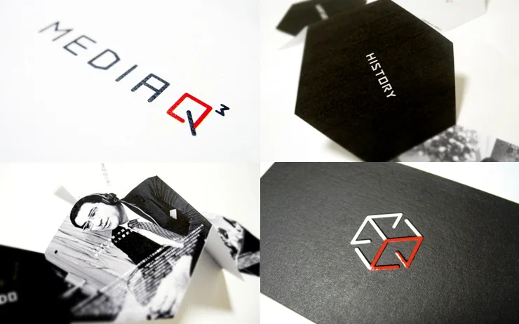
We can extend the brand to print (business cards, envelopes, company profile), keeping visuals consistent across all touchpoints to reinforce recognition and trust.
Role & stack
Brand discovery / Logo design / Web design & build / Responsive retrofit / Content collaboration (JA only)